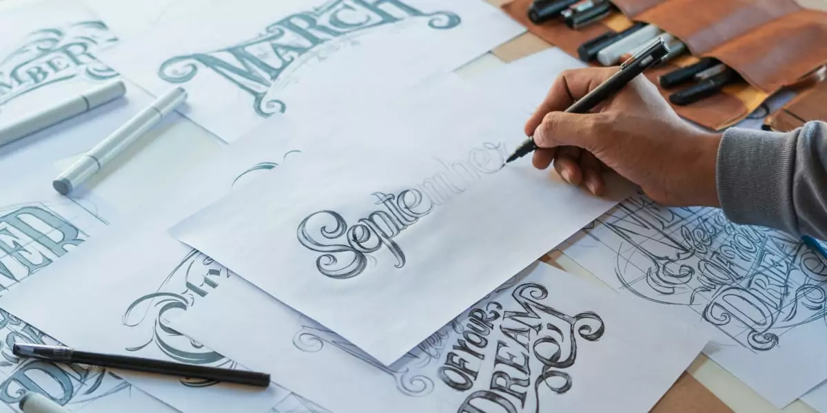
In the vast digital landscape, where words are not merely conveyors of information but also conveyors of style, fonts play a pivotal role. The world of typography is a canvas where every stroke, curve, and serif contributes to the visual identity and emotional resonance of a message. In this article, we delve into the enchanting realm of font styles and their profound impact on our digital experiences.
The Power of Typeface: A Visual Language
Fonts are not just letters; they are a visual language. They convey a message beyond the words they form. Think of a sleek, sans-serif font like Helvetica. Its clean lines and modern aesthetic evoke a sense of simplicity and efficiency. Now contrast that with a flowing, script font like Edwardian Script. Its ornate curls and graceful curves transport us to an era of elegance and formality.
Choosing the right font style is akin to choosing the right attire for a message. It sets the tone, conveys personality, and invites the reader into a particular atmosphere. From the crisp professionalism of business documents to the whimsical charm of children’s books, font style is a potent tool for communication.
The Art of Serifs and Sans-Serifs
One of the fundamental distinctions in fonts style lies in the presence or absence of serifs. Serifs are the small, decorative strokes at the end of letters, such as those found in Times New Roman. Serif fonts are often associated with tradition, formality, and readability in print. They have a timeless quality that’s favored in the world of literature and academia.
On the other hand, sans-serif fonts, as the name suggests, lack these decorative strokes. Fonts like Arial and Calibri fall into this category. Sans-serif fonts are renowned for their modern, clean appearance. They are often used in digital media, web design, and presentations, where clarity and readability on screens are paramount.
Diving into Diversity: Expressive Fonts
While serif and sans-serif fonts are the pillars of typography, the world of fonts is a rich tapestry of diversity. Display fonts, for instance, are designed to capture attention and make a statement. They’re often used for headlines, logos, or anything that demands impact.
Script fonts mimic cursive handwriting, adding a personal touch to invitations, letters, or creative projects. Monospaced fonts, with uniform spacing between characters, are the darlings of coders and typists. Each of these fonts has a unique personality, and choosing the right one can elevate your message to a work of art.
The Harmonious Blend: Combining Font Styles
Sometimes, the magic happens when font styles collaborate. Designers often mix fonts to create visual contrast and hierarchy in their layouts. A bold, attention-grabbing headline font can be paired with a simple, readable body text font. The interplay of contrasting styles adds depth and character to the overall design.
However, the key to successful font pairing lies in balance. Too many conflicting fonts can create chaos, while a well-thought-out combination can enhance the visual appeal of your project.
Conclusion: The Poetry of Fonts
In the digital age, fonts are not just tools; they’re storytellers. They infuse our words with personality, evoke emotions, and guide our reading experience. Whether it’s the timeless elegance of serifs or the contemporary clarity of sans-serifs, fonts are the silent poets of our digital narratives. The next time you craft a message, take a moment to explore the vast world of fonts, and let your words dance to the rhythm of their style.


