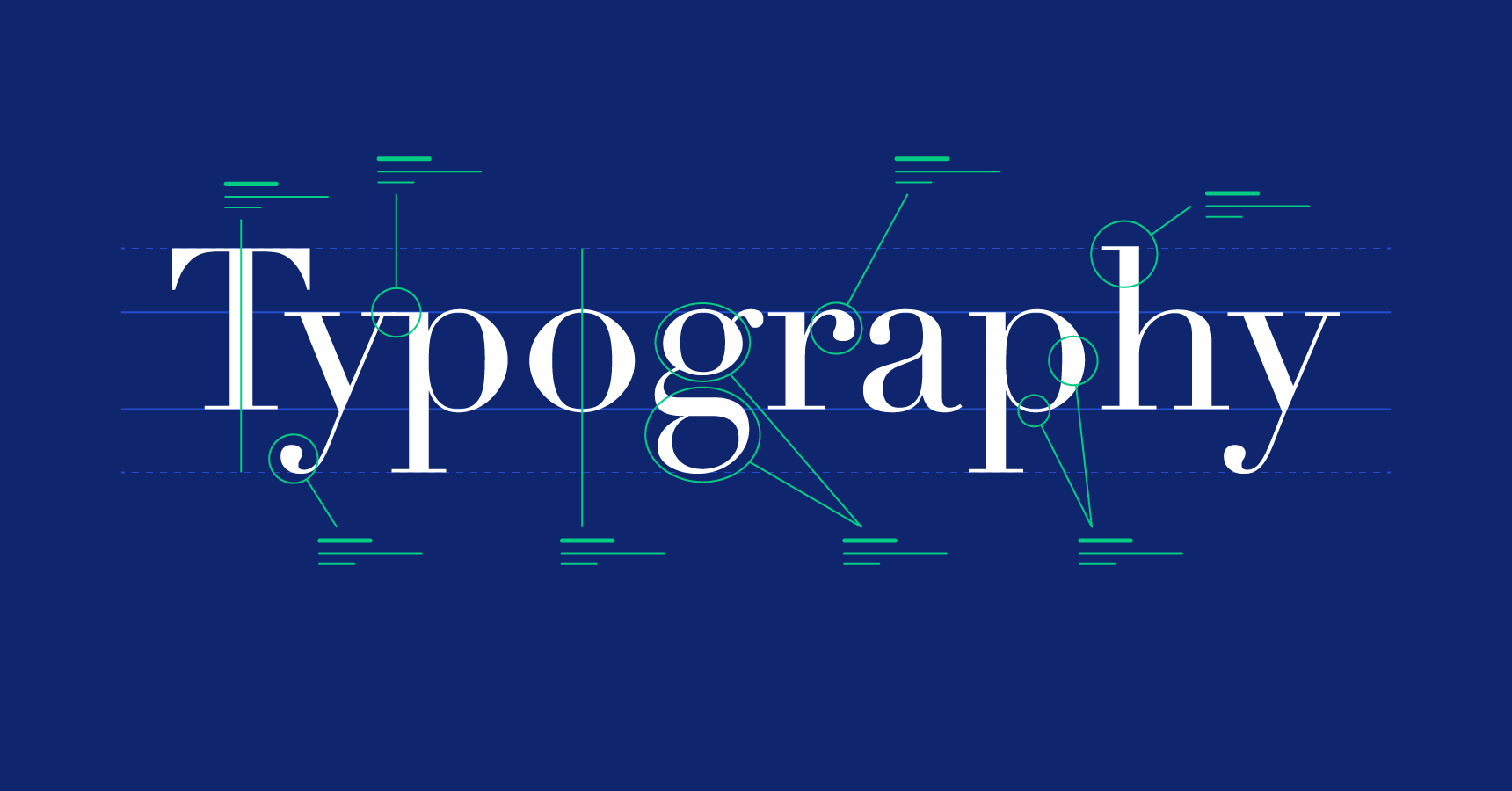
Typography, the art of arranging letters to create meaning and beauty, often begins with mastering the fundamentals – kerning, leading, hierarchy. But for those yearning to transcend mere competency and become typographic sorcerers, a boundless realm of advanced techniques awaits. Buckle up, fellow word-wielders, as we delve into the spellbook of advanced typography, conjuring visual magic that elevates your creations from everyday text to captivating expressions.
The Art of Contrast: Dancing with Light and Shadow
Imagine a canvas where black letters leap from a stark white background, demanding attention. Such is the power of contrast in typography. Master this elemental art, and you’ll create dynamic compositions that pull the viewer in, be it through bold sans-serif against delicate serifs, contrasting font weights within a family, or even unexpected colour juxtapositions. Remember, contrast isn’t just about extremes; subtle variations in hue, size, or texture can weave equally captivating spells.
The Rhythm of Text: Harnessing the Melody of Type
Words sing, even when unspoken. Learn to listen to the internal rhythm of your text, and you’ll discover the magic of letter spacing, line breaks, and even font selection, all dancing together to create a harmonious flow. Experiment with justified versus ragged edges, explore the interplay of short lines and long, and let the inherent musicality of language guide your typographic compositions. Remember, a well-tuned text resonates not just visually, but also audibly in the reader’s mind.
Visual Hierarchy: The Gentle Art of Guiding the Eye
Imagine a chaotic marketplace where every stall shouts with equal fervor. Typography, unlike such scenes, thrives on order. Master the art of visual hierarchy, and you’ll guide the reader’s eye effortlessly through your narrative, prioritizing key information. Size, weight, color, and placement – these are your tools for creating focus and flow. A larger headline whispers “read me first,” while a subtler caption invites exploration. Remember, hierarchy isn’t about domination; it’s about orchestrating a harmonious dance of elements, each contributing to the overall experience.
Beyond the Page: Typographic Sorcery in the Digital Realm
The digital canvas expands the possibilities of typographic spells. Embrace dynamic fonts that shift and morph, interact with cursor movements, or even respond to sound. Explore the wonders of web fonts, unlocking a vast library of character styles at your fingertips. Remember, the digital realm isn’t just about static screens; it’s about weaving interactivity and animation into the very fabric of your typographic creations.
Emotional Alchemy: Evoking Feelings Through Form
Imagine a font styles so playful it tickles the mind, or so elegant it evokes a sense of timeless sophistication. Typography, beyond mere information, has the power to conjure emotions. Delve into the world of font personalities, understanding how the curves and angles of letters whisper to the heart. Choose a rugged sans-serif to tell a story of adventure, or a flowing script to weave a tale of romance. Remember, your font choices become emotional brushstrokes, painting narratives not just with words, but with the very shapes that form them.
Storytelling with Type: From Micro to Macro
Typography tells stories not just through the words it forms, but also through the space it occupies. Master the art of micro-typography, tweaking kerning and leading to subtly guide the reader’s eye, and discover the power of macro-typography, where the overall layout speaks volumes. Remember, space itself becomes a character, building tension, inviting exploration, and whispering untold narratives between the lines.
The Sorcerer’s Tools: Cultivating Your Typographic Arsenal
No sorcerer wields magic without tools. Familiarize yourself with the treasure trove of resources at your disposal. Experiment with online font libraries, explore the intricacies of font-making software, and delve into the rich history of the written word. Remember, knowledge is power, and the deeper you delve into the universe of typography, the more potent your spells will become.
The Ethical Incantation: Wielding Power with Responsibility
With great power comes great responsibility. Remember, your typographic sorcery should serve, not manipulate. Ensure accessibility for all by utilizing legible fonts and clear layouts. Avoid cliches and overused trends, seeking originality while respecting the foundations of the craft. Remember, ethical typography elevates, empowers, and inspires, leaving a legacy of beauty and clarity in its wake.
So, take a deep breath, fellow word-wielders, and embrace the journey beyond the basics. Explore the hidden dimensions of typography, experiment with its transformative spells, and unleash the inner sorcerer within. Remember, the canvas is vast, the tools are endless, and the magic of typography awaits, ready to be unleashed upon the world through your creative vision.


